Heatmap-Diagramm
Eine Heatmap ist eine grafische Darstellung von Daten, in der die einzelnen Werte der Matrix als Farben dargestellt werden. Datenpunkte werden durch das Kreuzen der x- und y-Achsenwerte sowie einen dritten Wert definiert, der die Farbe des Punktes festlegt.
Wann verwendet man das?
Verwenden Sie Heatmaps, um Variablen über zahlreiche Kategorien hinweg zu vergleichen und komplexe Daten durch Farbintensität zu sortieren.
Wie funktioniert das?
Datenwerte
Datenwerte werden auf der Heatmap als Kästchen angezeigt. Größe und Farbe des jeweiligen Kästchens werden durch die Daten für dieses Element bestimmt:
- AuswahlgrößeWird durch die Konzentration der Kategorien auf der X- und Y-Achse bestimmt und ist nicht konfigurierbar.
- Farbewird durch den berechneten Wert bestimmt, der in der Einstellung Färben nach festgelegt ist.
Farbverläufe im Vergleich zu Farbabstufungen
Standardmäßig sind die niedrigsten Werte grün gefärbt, die mittleren Werte gelb und die höchsten Werte rot. Die Farben können vollständig angepasst werden.
Datenpunkte sind mit einem der folgenden Farbschemata der Anzeigeeinstellungen gefärbt:
- FarbverlaufFortlaufende Änderung von grün über gelb bis rot auf Basis einzelner Datenwerte
- Abgestufte FarbskalaIn abstandsgleiche Kategorien gruppierte Datenwerte, die mit unterschiedlichen Farben angezeigt werden.
Sie können die Anzahl der Schritte zur Gruppierung der Datenwerte in Diagrammen in den Anzeigeeinstellungen anpassen.
Beispiele
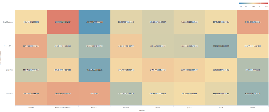
Heatmap-Diagramm
Unter Verwendung der Verkaufsdaten Ihres Unternehmens möchten Sie den durchschnittlichen Gewinn über eine große Anzahl von Kategorien in zwei Dimensionen darstellen: Region und Kundensegment. Dazu erstellen Sie eine Heatmap-Diagramm. Der durchschnittliche Wert für den Profit wird nach Farbe sortiert, von blau (niedrig) bis rot (hoch):
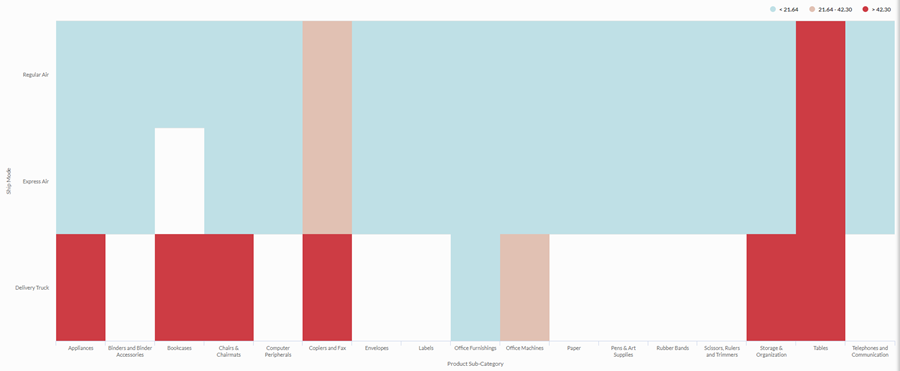
Abgestuftes Heatmap-Diagramm
Sie müssen die Beziehung zwischen der Versandmethode und der Produktkategorie für Ihr Unternehmen untersuchen. Sie suchen nach einer einfachen Analyse, die die durchschnittlichen Versandkosten in drei Klassen sortiert: niedrig, mittel und hoch.
Um eine visuelle Darstellung dieser Beziehung anzuzeigen, erstellen Sie eine abgestufte Heatmap mit drei Abstufungen. Die Werte werden in den entsprechenden Kassen auf Grundlage Schwellenwerte für die Abstufungen gruppiert:
Datenkonfigurationseinstellungen
From the Platform home page (www.diligentoneplatform.com), select the Results app to open it.
If you are already in Diligent One, you can use the left-hand navigation menu to switch to the Results app.
- Navigate to the appropriate table.
- On theConfigure
 panel, clickDataand configure the following settings:
| Einstellung | Unterstützte Datentypen | Beschreibung |
|---|---|---|
| X-Axis |
| The field to use as the category on the chart's horizontal scale. |
| Y-Axis |
| The field to use as the category on the chart's vertical scale. |
| Color by | numeric | The field that determines the color of the box at the intersection of the X and Y axis values:
Tip You can control decimals and rounding on numeric data by changing format of this field. For the Average aggregate option, Format options is available in the Data tab of the Configure Visualization panel. For all other aggregate options, format options set in Table View is applied. For help doing this, see Optionen zur Datenformatierung. |
Format options | numeric | Select an option in this field to apply formatting such as decimals and rounding to the Y-axis values in the chart. For help doing this, see Optionen zur Datenformatierung. Format options is available only for the Average aggregate option. For all other aggregate options, format options set in Table View is applied. |
Einstellungen für die Diagrammanzeige
From the Platform home page (www.diligentoneplatform.com), select the Results app to open it.
If you are already in Diligent One, you can use the left-hand navigation menu to switch to the Results app.
- Navigate to the appropriate table.
- On theConfigurepanel, clickDisplayand configure the following settings:
| Einstellung | Beschreibung |
|---|---|
| Optionen | |
| Show Legend | Show or hide the legend at the top of the chart. |
| Show Values | Show or hide the data point values. |
| Boost performance | Switches into performance mode when data points on the chart go beyond 150 by applying some trade-offs. For more information, see Performance der Diagramme steigern. |
| X-Axis | |
| Show Label | Show or hide the label for the x-axis. |
| Y-Axis | |
| Show Label | Show or hide the label for the left y-axis. |
| Other settings | |
| Color | The starting, middle, and ending values for the heatmap range. You can specify a color and numeric boundary for each place on the scale. |
| Stepped Colors | Display the categories as discrete buckets rather than a constant scale. You can specify between 2 and 20 steps. |