
バブル チャート
バブル チャートは、変数の未加工のカウント、頻度、または比率を表します。バブルの大きさは数量を表し、バブルの色はカテゴリを、X と Y 軸は双方とも独立した値を表します。
この機能を使う状況
バブル チャートは、それぞれが値の一式を含む 3 つのデータ系列で作業する場合に使用します。分類するために、任意で 4 番目の変数を追加することができます。バブルの大きさは、特定の値を強調したり、カテゴリ間を比較する場合に有効です。
バブル チャートをデザインする場合、これらのチャートでは視覚化の解釈を促すためのクリアなラベル付けが必要であるため、クリアかつ見えるラベルを使用します。
例
3 次元のバブル チャート
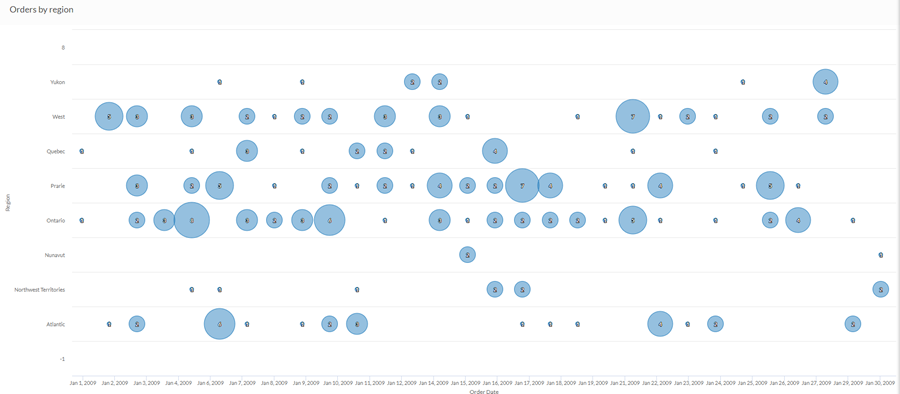
一か月からの売上データを使用し、その期間に各地域から受注のあったオーダーの割合を特定したいと願っています。簡易バブル チャートを使用して、その期間の地域ごとのオーダー数を描きます。
4 次元のバブル チャート
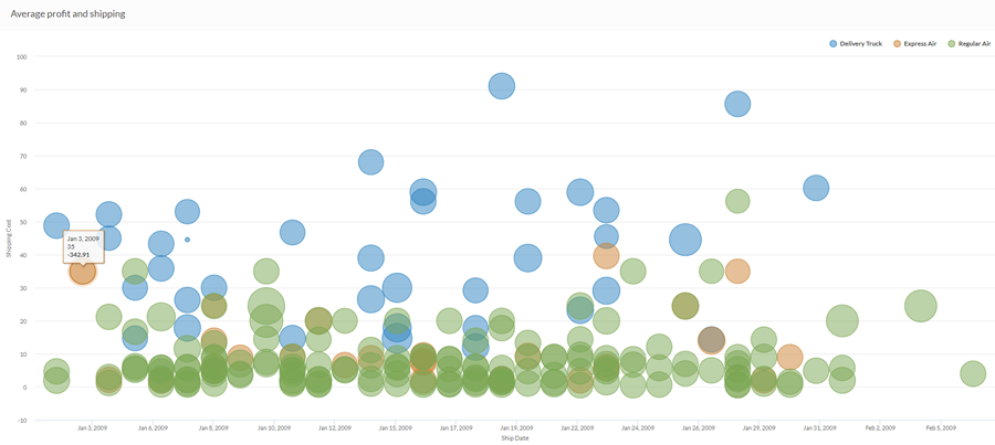
一か月からの売上データを使用し、出荷と利益の関係を特定したいと願っています。複雑なバブル チャートを使用して、その月の出荷コストと出荷方法を関連付けて、平均の利益を描きます。
データ構成の設定
プラットフォームホーム ページ (www.diligentoneplatform.com) から、結果 アプリを選択して開きます。
すでに Diligent One を使用している場合は、左側のナビゲーション メニューを使用して 結果 アプリに切り替えることができます。
- Navigate to the appropriate table.
- On theConfigure
 panel, clickDataand configure the following settings:
| 設定 | サポートされているデータ型 | 説明 |
|---|---|---|
| X-Axis |
| The field to use as the basis for the chart's horizontal scale. |
Y-Axis |
| The field to use as the basis for the chart's vertical scale. |
Bubble size | numeric | The numeric field to use to determine the size of individual data points. An increase in size indicates an increase in quantity or value. You can select a count of the x-axis field or one of several aggregate values for a different numeric column in the table:
ヒント 数値データの小数と四捨五入を制御するには、その数値フィールドの書式を変更します。 平均集計オプションでは、[視覚化の構成]パネルの[データ]タブで書式オプションを使用できます。他のすべての集計オプションでは、テーブル ビューで設定された書式オプションが適用されます。これを行う方法の詳細については、「データの書式設定オプション」を参照してください。 |
Color by optional | character | The field represented by the fourth data dimension to the chart. Adding a fourth data dimension identifies the data points by category. You can think of the Color by field as a break field. |
Format options | numeric | Select an option in this field to apply formatting such as decimals and rounding to the Y-axis values in the chart. For help doing this, see データの書式設定オプション. Format options is available only for the Average aggregate option. For all other aggregate options, format options set in Table View is applied. |
グラフ表示の設定
プラットフォームホーム ページ (www.diligentoneplatform.com) から、結果 アプリを選択して開きます。
すでに Diligent One を使用している場合は、左側のナビゲーション メニューを使用して 結果 アプリに切り替えることができます。
- Navigate to the appropriate table.
- On theConfigurepanel, clickDisplayand configure the following settings:
| 設定 | 説明 |
|---|---|
| オプション | |
| Show Legend | Show or hide the legend at the top of the chart. |
| Show Values | Show or hide the data point values. |
| Boost performance | Switches into performance mode when data points on the chart go beyond 150 by applying some trade-offs. For more information, see グラフのパフォーマンスの向上. |
| X-Axis | |
| Show Label | Show or hide the label for the x-axis. |
| Y-Axis | |
| Show Label | Show or hide the label for the left y-axis. |
| Other settings | |
| Bubble scale | Specifies the size of the bubbles with the options 1 through 3, 1 being the smallest and 3 being the biggest. Default is 1. |
| Colors | The colors assigned to each series in the Color by dimension. |
