
コンビネーショングラフ
コンビネーショングラフは、単一のグラフで2種類のグラフを表示します。共通ポイントに関連する2つの異なるデータセットを、コンビネーショングラフを使用して単一のグラフ上に表示できます。これは、1つのカラムチャート上に重ね合わせた1つの折れ線グラフから構成されています。コンビネーショングラフでは、2つの異なる測定スケールを表す二重の Y軸を持つことができます。グラフ表示の設定で、二重の Y軸を有効化できます。
この機能を使う状況
同じ視覚化の中での棒と線のコンビネーションは、組み合わせると比較時に明確な見解が得られるため、異なるカテゴリにおいて値を比較する場合に有益です。たとえば、コンビネーショングラフを使用して、異なる期間で販売予測を販売実績と比較します。
コンビネーショングラフは、異なる測定スケールでも共通ポイントと関連している2つの変数間の関係を検証する場合に役立ちます。たとえば、2つのグラフが、共通のカテゴリの X軸(地域など) を共有し、複数の定量的 Y軸を持ち、それぞれが異なるスケールの値(収益と利益など)を表す可能性がある場合。
ヒント
コンビネーショングラフは、さらなる調査を要するデータにおいてトレンドを観察し、偏差を特定するのに最も有益です。
例
シンプルなコンビネーショングラフ
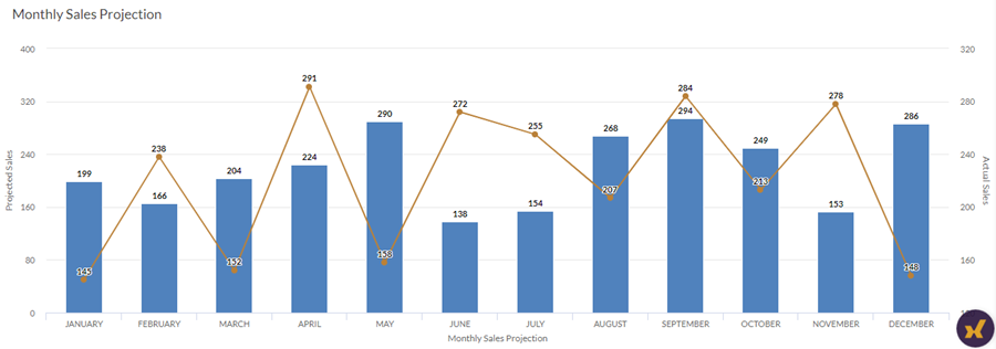
会社では、販売データを追跡しており、月次の販売予測と販売実績の数値を比較してそのトレンドを判断する必要があります。二重軸のあるシンプルなコンビネーショングラフを使用すると、販売数値を視覚化し、一定期間のトレンドを明確に実証できます。
グループ化コンビネーショングラフ
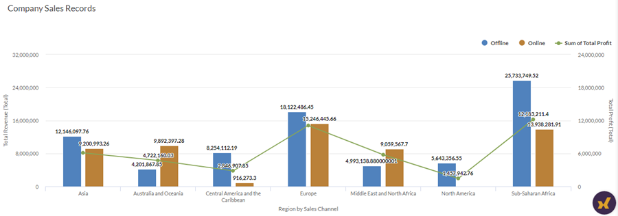
会社では、販売データを追跡しており、収益合計を利益合計と比較して判断する必要があります。分析対象は、各地域、販売チャネルごとにグループ化された地域(例:オフラインとオフラインなど)です。
二重軸のあるグループ化されたコンビネーショングラフを使用すると、収益と利益の数値合計を視覚化し、さまざまな地域間でのトレンドの比較を明確にして実証できます。グループ化により、各販売チャネルごとに生み出された収益も判断できます。
積み重ねコンビネーショングラフ
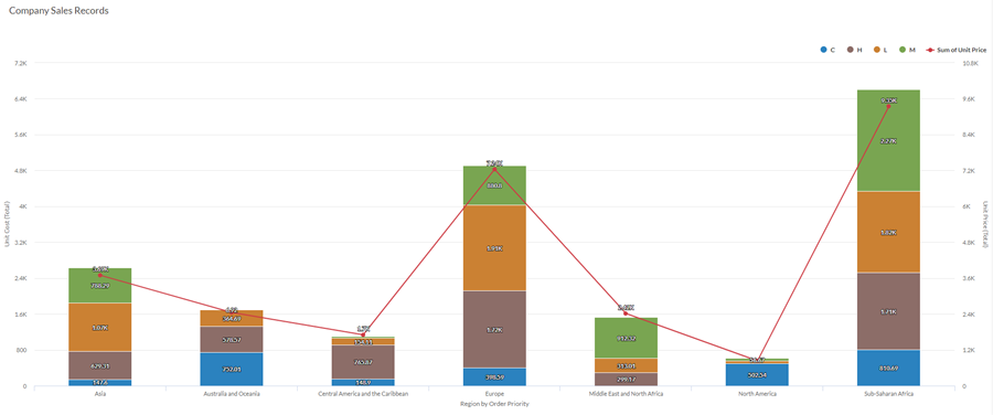
会社では、販売データを追跡しており、倉庫の物品の単位原価と単位価格を比較して判断する必要があります。分析対象は、地域、物品の注文優先度によって積み重ねる地域、 重大、高、低、中程度などです。
二重軸のある積み重ねコンビネーショングラフを使用すると、物品の単位原価を単位価格と比較して視覚化し、さまざまな地域間でのトレンドの比較を明確にして実証できます。積み重ねることで、注文の優先度ごとに単位原価を判断することもできます。
データ構成の設定
プラットフォームホーム ページ (www.diligentoneplatform.com) から、結果 アプリを選択して開きます。
すでに Diligent One を使用している場合は、左側のナビゲーション メニューを使用して 結果 アプリに切り替えることができます。
- 該当するテーブルに移動します。
- [構成
 ]パネルで[データ]をクリックし、次の設定を構成します。
| 設定 | サポートされているデータ型 | 説明 |
|---|---|---|
X-Axis |
| The field to use as the basis for the chart's horizontal scale. One bar is created for each unique value in the field, or each unique combination of values if you also specify a Color by field. |
Y-Axis Column | numeric | The aggregate value represented by the chart's vertical axis. You can select a count of the x-axis field or one of several aggregate values for a different numeric column in the table:
Tip Use the Count option to create a histogram that displays the distribution of data for the x-axis. ヒント 数値データの小数と四捨五入を制御するには、その数値フィールドの書式を変更します。 平均集計オプションでは、[視覚化の構成]パネルの[データ]タブで書式オプションを使用できます。他のすべての集計オプションでは、テーブル ビューで設定された書式オプションが適用されます。これを行う方法の詳細については、「データの書式設定オプション」を参照してください。 |
Y-Axis Line | numeric | The aggregate value represented by the chart's vertical axis. You can select a count of the x-axis field or one of several aggregate values for a different numeric column in the table:
The position of data points on the vertical scale determines the height of each line. The height of a line is interpolated or gapped if a data point is missing. ヒント 数値データの小数と四捨五入を制御するには、その数値フィールドの書式を変更します。 平均集計オプションでは、[視覚化の構成]パネルの[データ]タブで書式オプションを使用できます。他のすべての集計オプションでは、テーブル ビューで設定された書式オプションが適用されます。これを行う方法の詳細については、「データの書式設定オプション」を参照してください。 |
Color by optional | character | The field represented by the third data dimension to the chart. Adding a third data dimension can sub-divide x-axis categories. You can think of the Color by field as a break field. |
Format options | numeric | Select an option in this field to apply formatting such as decimals and rounding to the Y-axis values in the chart. For help doing this, see データの書式設定オプション. Format options is available only for the Average aggregate option. For all other aggregate options, format options set in Table View is applied. |
グラフ表示の設定
プラットフォームホーム ページ (www.diligentoneplatform.com) から、結果 アプリを選択して開きます。
すでに Diligent One を使用している場合は、左側のナビゲーション メニューを使用して 結果 アプリに切り替えることができます。
- 該当するテーブルに移動します。
- [構成]パネルで[表示]をクリックし、次の設定を構成します。
| 設定 | 説明 |
|---|---|
| オプション | |
| Show Legend | Show or hide the legend at the top of the chart. |
| Show Values | Show or hide the data point values. |
| Round Edges | Smooths out the transitions between data points to create a curved line chart. |
| Boost performance | Switches into performance mode when data points on the chart go beyond 150 by applying some trade-offs. For more information, see グラフのパフォーマンスの向上. |
| Column Type | How to display the third dimension of the chart (Color by):
|
| X-Axis | |
| Show Label | Show or hide the label for the x-axis. |
| Y-Axis (Left) | |
| Show Label | Show or hide the label for the left y-axis. |
| Min | The minimum value to use for the left y-axis. By default, the chart uses the lowest value of the left y-axis data to determine the minimum. |
| Max | The maximum value to use for the left y-axis. By default, the chart uses the highest value of the left y-axis data to determine the minimum. |
| Show dual Y-Axis | Show or hide the Y-Axis (Right). |
| Y-Axis (Right) | |
| Show Label | Show or hide the label for the right y-axis. |
| Min | The minimum value to use for the right y-axis. By default, the chart uses the lowest value of the right y-axis data to determine the minimum. |
| Max | The maximum value to use for the right y-axis. By default, the chart uses the highest value of the right y-axis data to determine the minimum. |
| Other settings | |
| Colors | The colors assigned to each series in the Color by dimension. |
グラフの並べ替えの設定
プラットフォームホーム ページ (www.diligentoneplatform.com) から、結果 アプリを選択して開きます。
すでに Diligent One を使用している場合は、左側のナビゲーション メニューを使用して 結果 アプリに切り替えることができます。
- 該当するテーブルに移動します。
- [構成]パネルで[並べ替え]をクリックし、次の設定を構成します。
設定 説明 オプション Sorting Sorts the data categories by ascending or descending total value, by default (alphabetically), or in custom order. To apply a custom order, click and drag the values in the Sort tab into the necessary order.
メモ
列の値に基づいて並べ替えが行われます。
