ヒート マップのグラフ
ヒート マップは、マトリクスに含まれる各値を色として表した、グラフィカルなデータ表現です。データ ポイントは、X 軸の値と Y 軸の値の交点と、データ ポイントの色を決定する 3 番目の値によって定義されます。
この機能を使う状況
多数のカテゴリにわたり変数を比較し、色の強さで複雑なデータを並び替えるには、ヒート マップを使用します。
動作
データの値
データの値は、ヒートマップではボックスとして表示されます。各ボックスのサイズおよび色は、その項目のデータによって決まります。
- サイズX 軸のカテゴリと Y 軸のカテゴリの集合化によって決まるため、設定することはできません。
- 色[色付けの基準]設定に指定された計算値によって決定されます。
グラデーション vs 段階的な色
デフォルトでは、低いレベルの値は緑色、中間レベルの値は黄色、高いレベルの値は赤色でそれぞれ表示されます。色は完全にカスタマイズ可能です。
データ ポイントの色は、表示設定用の下記配色のいずれかを使って表示されます。
- 色のグラデーション個々のデータ値に従って、緑色から黄色を介して赤色へと連続的に変化する
- 段階的なカラー スケールデータ値が等間隔の 5 つのカテゴリにグループ化され、それぞれ異なる色で表示されます。
グラフの表示設定でデータ値をグループ化するために使用される段階の数をカスタマイズできます。
例
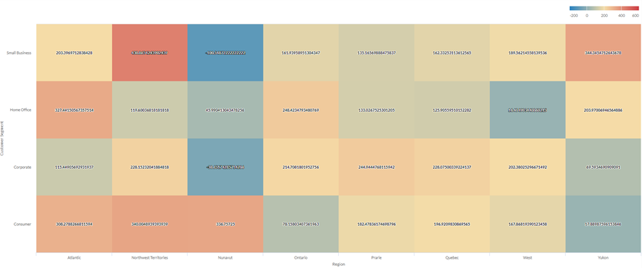
ヒート マップのグラフ
会社の売上データを使用して、地域と顧客セグメントの 2 つの次元で多数のカテゴリに及ぶ平均利益を示したいとします。これを行うには、ヒート マップのグラフを作成します。平均利益の値は、色別に青(低)から赤(高)の順に並べ替えられます。
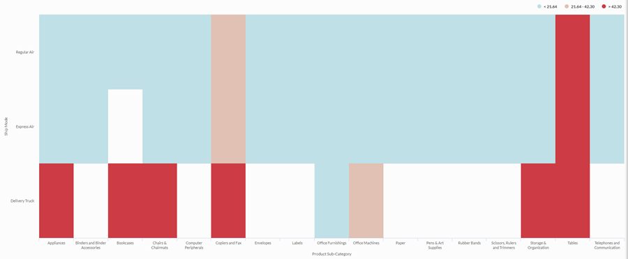
段階的なヒート マップのグラフ
会社の出荷方法と製品カテゴリ間の関係を調査する必要があります。平均出荷コストを、低、中、高の 3 つのビンにグループ化する簡易な分析を探しています。
この関係を視覚化するには、3 つの段階のある段階的ヒート マップを作成します。段階のしきい値に基づき、対応するビンに値がグループ化されます。
データ構成の設定
From the Platform home page (www.diligentoneplatform.com), select the Results app to open it.
If you are already in Diligent One, you can use the left-hand navigation menu to switch to the Results app.
- Navigate to the appropriate table.
- On theConfigure
 panel, clickDataand configure the following settings:
| 設定 | サポートされているデータ型 | 説明 |
|---|---|---|
| X-Axis |
| The field to use as the category on the chart's horizontal scale. |
| Y-Axis |
| The field to use as the category on the chart's vertical scale. |
| Color by | numeric | The field that determines the color of the box at the intersection of the X and Y axis values:
Tip You can control decimals and rounding on numeric data by changing format of this field. For the Average aggregate option, Format options is available in the Data tab of the Configure Visualization panel. For all other aggregate options, format options set in Table View is applied. For help doing this, see データの書式設定オプション. |
Format options | numeric | Select an option in this field to apply formatting such as decimals and rounding to the Y-axis values in the chart. For help doing this, see データの書式設定オプション. Format options is available only for the Average aggregate option. For all other aggregate options, format options set in Table View is applied. |
グラフ表示の設定
From the Platform home page (www.diligentoneplatform.com), select the Results app to open it.
If you are already in Diligent One, you can use the left-hand navigation menu to switch to the Results app.
- Navigate to the appropriate table.
- On theConfigurepanel, clickDisplayand configure the following settings:
| 設定 | 説明 |
|---|---|
| オプション | |
| Show Legend | Show or hide the legend at the top of the chart. |
| Show Values | Show or hide the data point values. |
| Boost performance | Switches into performance mode when data points on the chart go beyond 150 by applying some trade-offs. For more information, see グラフのパフォーマンスの向上. |
| X-Axis | |
| Show Label | Show or hide the label for the x-axis. |
| Y-Axis | |
| Show Label | Show or hide the label for the left y-axis. |
| Other settings | |
| Color | The starting, middle, and ending values for the heatmap range. You can specify a color and numeric boundary for each place on the scale. |
| Stepped Colors | Display the categories as discrete buckets rather than a constant scale. You can specify between 2 and 20 steps. |