折れ線グラフ
折れ線グラフは、直線部分で接続された一連のデータ ポイントを表示することで、傾向や経時的変化を表します。フィールドごとに色分けされたさまざまなカテゴリに基づいて、複数行として単一のデータフィールドを表示できます。
この機能を使う状況
短期または長期の経時的変化を追跡し、予測データ分析を支援する場合、折れ線グラフを使用します。小さい頻繁な変化が連続内に存在する場合、折れ線グラフは、経時的変化の視覚化という点で棒グラフよりも効果的です。
折れ線グラフはまた、複数のグループまたはカテゴリについて同一期間の経時的変化を比較する場合にも有用です。
ヒント
折れ線グラフの X 軸では時刻や日付といった独立変数、Y 軸には従属数値変数を使用します。
例
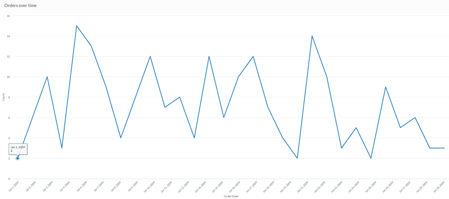
簡易な折れ線グラフ
先月の売上データを使用して、経時的なオーダーの傾向を示したいと願っています。これを行うには、オーダーの数を描く折れ線グラフを使用します。
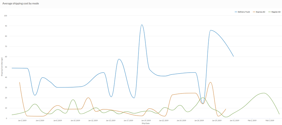
曲線マルチシリーズ折れ線グラフ
先月の売上データを使用して、会社が採用する各出荷方法における平均出荷コストの傾向を示したいとします。これを行うには、出荷方法ごとに各シリーズをグループ化する折れ線グラフを使用します。
データ構成の設定
プラットフォーム ホームページ (www.diligentoneplatform.com) から、リザルト アプリを選択して開きます。
すでに Diligent One を使用している場合は、左側のナビゲーション メニューを使用してリザルト アプリに切り替えることができます。
- Navigate to the appropriate table.
- On theConfigure
 panel, clickDataand configure the following settings:
| 設定 | サポートされているデータ型 | 説明 |
|---|---|---|
| X-Axis |
| The field to use as the basis for the chart's horizontal scale. Using a character field as the basis for the x-axis allows you to display a line chart that shows X number of comparisons for a given Y value aggregate. This is especially useful when combined with the Color by option, which allows you to display separate lines, differentiated by color, for each selected field. Character fields along the x-axis are sorted in alphabetical order by default. |
Y 軸 | numeric | The aggregate value represented by the chart's vertical axis. You can select a count of the x-axis field or one of several aggregate values for a different numeric column in the table:
The position of data points on the vertical scale determines the height of each line. The height of a line is interpolated or gapped if a data point is missing. ヒント 数値データの小数と四捨五入を制御するには、その数値フィールドの書式を変更します。 平均集計オプションでは、[視覚化の構成]パネルの[データ]タブで書式オプションを使用できます。他のすべての集計オプションでは、テーブル ビューで設定された書式オプションが適用されます。これを行う方法の詳細については、「データの書式設定オプション」を参照してください。 |
色付けの基準(任意設定) | character | グラフの 3 番目のデータ次元で表されるフィールド。3 番目のデータ次元を追加すると、線で表現されるカテゴリが作成されます。フィールドの一意の値ごとに、個別の線が作成されます。 |
書式オプション | 数値 | このフィールドのオプションを選択すると、小数点や端数処理などの書式設定をグラフの Y 軸値に適用します。これを行う方法の詳細については、「データの書式設定オプション」を参照してください。 書式オプションは、平均集計オプションでのみ使用できます。他のすべての集計オプションでは、テーブル ビューで設定された書式オプションが適用されます。 |
グラフ表示の設定
プラットフォーム ホームページ (www.diligentoneplatform.com) から、リザルト アプリを選択して開きます。
すでに Diligent One を使用している場合は、左側のナビゲーション メニューを使用してリザルト アプリに切り替えることができます。
- Navigate to the appropriate table.
- On theConfigurepanel, clickDisplayand configure the following settings:
| 設定 | 説明 |
|---|---|
| オプション | |
| Show Legend | Show or hide the legend at the top of the chart. |
| Show Values | Show or hide the data point values. |
| Round Edges | Smooths out the transitions between data points to create a curved line chart. |
| Interpolate | 欠如しているデータ ポイントを処理するため、利用できるデータ ポイントを線で結ぶが、欠如しているデータ ポイントは X 軸に描画しない これを無効にすると、欠如しているデータ ポイントは線で結ばれることがなくなる |
| Boost performance | グラフ上のデータポイントが、トレードオフの適用によって150を超える場合に、パフォーマンスモードに切り替わります。詳細については、「グラフのパフォーマンスの向上」を参照してください。 |
| X-Axis | |
| Show Label | Show or hide the label for the x-axis. |
| Y-Axis | |
| Show Label | Show or hide the label for the left y-axis. |
| Min | The minimum value to use for the left y-axis. By default, the chart uses the lowest value of the left y-axis data to determine the minimum. |
| Max | The maximum value to use for the left y-axis. By default, the chart uses the highest value of the left y-axis data to determine the minimum. |
| Other settings | |
| Colors | The colors assigned to each series in theColor bydimension. |