
円グラフ
円グラフは、全体に対する各カテゴリの比率または割合を示すものです。円で表現する数量に比例する各セグメントを持つカテゴリ データの構成要素を示す場合、円グラフを使用します。
この機能を使う状況
円グラフは、ある静止期間での全体の中の一部を比較する場合に有効です。経時的変化は示されません。
次のデータを使って作業をする場合、円グラフの使用を検討してください。
- 1 データ セット円グラフは 1 データ セットの分類および比較に有効です。
- 正の値円グラフは、ゼロを表示することができず、負の値を使用して作業する場合は混乱が生じる場合があります
- 7 つ以下のカテゴリー7 つ以上のカテゴリで作業をする場合は、各セグメントの相対的サイズを把握するのがますます困難になります
例
標準円グラフ
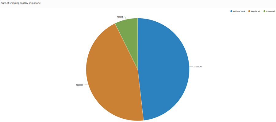
会社が出荷コストとして支払う合計金額のうち、最も大きな合計割合を表す出荷方法を特定する必要があるとします。円グラフを使用して、各方法が表す総額の割合(%)を示します。
ドーナツ型円グラフ
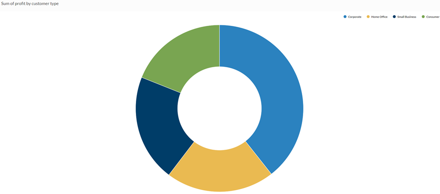
顧客の種類と利益に関係があるかどうかを判断する必要があります。円グラフを使用して、顧客の各カテゴリについて利益総額を示し、売上の最も重要なセグメントを表す顧客の種類を表します。
データ構成の設定
プラットフォームホーム ページ (www.diligentoneplatform.com) から、結果 アプリを選択して開きます。
すでに Diligent One を使用している場合は、左側のナビゲーション メニューを使用して 結果 アプリに切り替えることができます。
- Navigate to the appropriate table.
- On theConfigure
 panel, clickDataand configure the following settings:
| 設定 | サポートされているデータ型 | 説明 |
|---|---|---|
| Categories displayed |
| The field represented by pie chart sections. One section is created for each unique value in the field. |
| Value | numeric | The aggregate value that serves as the basis for the chart's values. The total of all values in the field for each category determines the size of the pie chart sections. ヒント 数値データの小数と四捨五入を制御するには、その数値フィールドの書式を変更します。 平均集計オプションでは、[視覚化の構成]パネルの[データ]タブで書式オプションを使用できます。他のすべての集計オプションでは、テーブル ビューで設定された書式オプションが適用されます。これを行う方法の詳細については、「データの書式設定オプション」を参照してください。 |
Format options | numeric | Select an option in this field to apply formatting such as decimals and rounding to the Y-axis values in the chart. For help doing this, see データの書式設定オプション. Format options is available only for the Average aggregate option. For all other aggregate options, format options set in Table View is applied. |
グラフ表示の設定
プラットフォームホーム ページ (www.diligentoneplatform.com) から、結果 アプリを選択して開きます。
すでに Diligent One を使用している場合は、左側のナビゲーション メニューを使用して 結果 アプリに切り替えることができます。
- Navigate to the appropriate table.
- On theConfigurepanel, clickDisplayand configure the following settings:
| 設定 | 説明 |
|---|---|
| オプション | |
| Show Legend | Show or hide the legend at the top of the chart. |
| Show Values | Show or hide the data point values. |
| Show Percentages | Show or hide the percentage that each proportion represents of the whole. |
| Show Total | Shows the sum total of the pie chart values. |
| Boost performance | Switches into performance mode when data points on the chart go beyond 150 by applying some trade-offs. For more information, see グラフのパフォーマンスの向上. |
| Donut | Display the pie chart as a donut chart rather than a traditional pie chart. |
| Ratio | Controls the size of the donut hole in relation to the chart as a whole. Specify a larger value to increase the size of the hole. The maximum value is 0.7. |
| Other settings | |
| Colors | The colors assigned to each category. |
