
面グラフ
面グラフは、特定の時点で各カテゴリが表す合計の比率を示すことで、履歴データによる傾向や変化を比較します。複数データの連続を比較する場合は、個別の値ではなく、傾向全体を明らかにします。
この機能を使う状況
経時的に各カテゴリがいかに累計に貢献しているかを示すには、面グラフを使用します。
時系列の関係を代表するという点で、面グラフほど効果的なグラフはほとんどありません。グラフの面の部分は、軸とデータ ポイント間のスペースでの全体の量または比率を代表します。
ヒント
時系列は、一般的には同等の間隔で、時間順に一覧されている一連のデータ ポイントです。
利用可能な面グラフの種類
次の種類の面グラフが利用できます。
| Icon | Type | Description |
|---|---|---|
 | Standard | Shows a quantitative progression over time. |
 | Stacked | Shows the proportion of the total that each category represents at any given point in time. |
| 100% Stacked | Shows how the constituent parts of a whole have changed over time. |

例
標準面グラフ
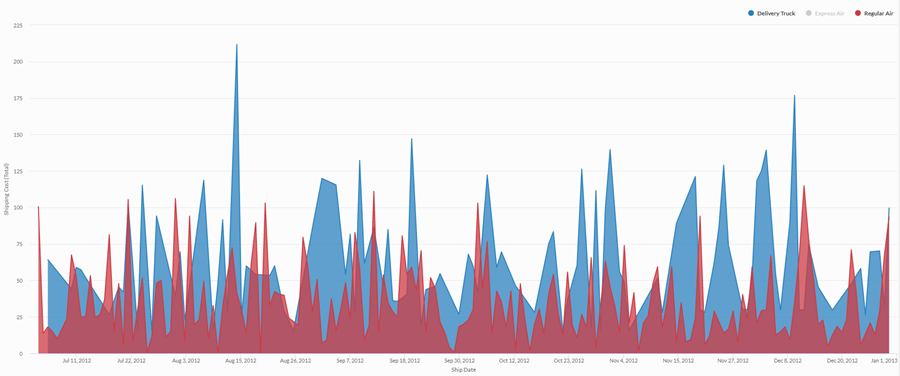
4 年間の期間における集約された売上データを使用して、会社が使用している各出荷方法における出荷コストの傾向を伝える必要があるとします。そのためには、その期間のコストの傾向を出荷方法別に示す標準面グラフを作成します。
積み上げ面グラフ
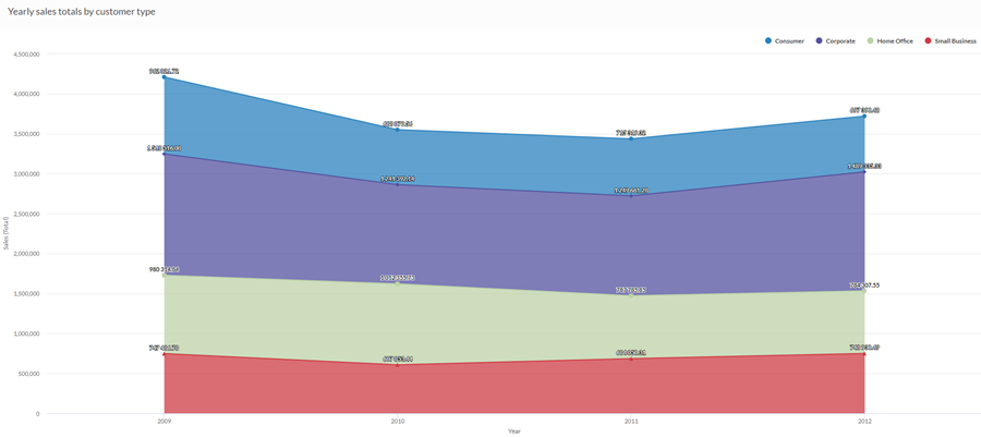
4 年間の期間における集約された売上データを使用して、売上全般の比例的傾向を、経時的に顧客のセグメント別に分類して話し合う必要があります。そのためには、その期間の傾向を示す積み上げ面グラフを作成します。
100% 積み上げ面グラフ
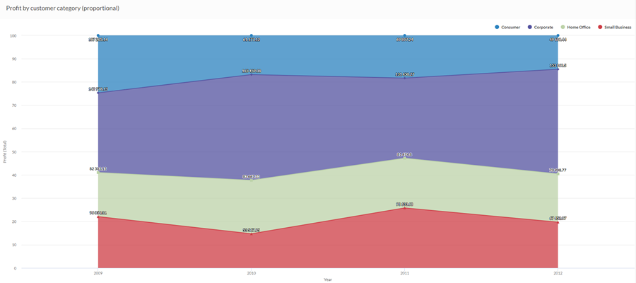
4 年間の期間における集約された売上データを使用して、さまざまな顧客セグメントへの売上が経時的にどのように変化しているかを話し合う必要があります。そのためには、合計に関して、経時的に各セグメントがどのように実行しているかを示す 100% 積み上げ面グラフを作成します。
データ構成の設定
プラットフォームホーム ページ (www.diligentoneplatform.com) から、結果 アプリを選択して開きます。
すでに Diligent One を使用している場合は、左側のナビゲーション メニューを使用して 結果 アプリに切り替えることができます。
- Navigate to the appropriate table.
- On theConfigure
 panel, clickDataand configure the following settings:
| 設定 | サポートされているデータ型 | 説明 |
|---|---|---|
| X-Axis |
| The field to use as the basis for the chart's horizontal scale. |
Y-Axis | numeric | The aggregate value represented by the chart's vertical axis. You can select a count of the x-axis field or one of several aggregate values for a different numeric column in the table:
The position of data points on the vertical scale determines the height of each line. The height of a line is interpolated or gapped if a data point is missing. ヒント 数値データの小数と四捨五入を制御するには、その数値フィールドの書式を変更します。 平均集計オプションでは、[視覚化の構成]パネルの[データ]タブで書式オプションを使用できます。他のすべての集計オプションでは、テーブル ビューで設定された書式オプションが適用されます。これを行う方法の詳細については、「データの書式設定オプション」を参照してください。 |
Color by optional | character | The field represented by the third data dimension to the chart. Adding a third data dimension creates the categories represented by stacked areas. A separate stacked area is created for each unique value in the field. |
Format options | numeric | Select an option in this field to apply formatting such as decimals and rounding to the Y-axis values in the chart. For help doing this, see データの書式設定オプション. Format options is available only for the Average aggregate option. For all other aggregate options, format options set in Table View is applied. |
グラフ表示の設定
プラットフォームホーム ページ (www.diligentoneplatform.com) から、結果 アプリを選択して開きます。
すでに Diligent One を使用している場合は、左側のナビゲーション メニューを使用して 結果 アプリに切り替えることができます。
- Navigate to the appropriate table.
- On theConfigurepanel, clickDisplayand configure the following settings:
| 設定 | 説明 |
|---|---|
| オプション | |
| Show Legend | Show or hide the legend at the top of the chart. |
| Show Values | Show or hide the data point values. |
| Interpolate | Handle missing data points by connecting the line using the available data points, but do not plot the missing data point on the x-axis. If disabled, the line is not connected across missing data points. |
| Boost performance | Switches into performance mode when data points on the chart go beyond 150 by applying some trade-offs. For more information, see グラフのパフォーマンスの向上. |
| Chart Type | The type of area chart to use:
|
| X-Axis | |
| Show Label | Show or hide the label for the x-axis. |
| Y-Axis | |
| Show Label | Show or hide the label for the left y-axis. |
| Min | The minimum value to use for the left y-axis. By default, the chart uses the lowest value of the left y-axis data to determine the minimum. |
| Max | The maximum value to use for the left y-axis. By default, the chart uses the highest value of the left y-axis data to determine the minimum. |
| Other settings | |
| Colors | The colors assigned to each series in the Color by dimension. |
