解釈と視覚化
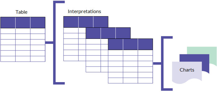
解釈は、コレクションでのテーブルに基づいた、フィルター、視覚化、および統計を集めたコレクションです。これらを使用して、結果を解釈、視覚化し、データに隠れた事実と洞察をより深く理解します。
機能の仕組み
コレクションの各テーブルはデフォルトの解釈で開始します。デフォルトの解釈は、修正および処理レコード用に提供されたビューです。保存された変更は、レコードを処理するときに他のユーザーがアクセスできるあらかじめ設定されたビューです。新しい解釈も作成できます。各解釈は、基礎的なソース テーブルでデータの一意のビューを提供します。この構造により、地域、四半期、または、データを整理、分離するために使用するその他のカテゴリなどの次元に基づき、データの複数のビューを作成できます。
解釈を使って、ストーリーボード アプリでストーリーボードを作成することができます。ストーリーボード アプリで使用するには、解釈を保存する必要があります (デフォルトの解釈もそのようにします) 。
メモ
解釈を作成および保存する機能は、割り当てられたロールによって異なります。Professional 部門長のみがこの解釈をカスタマイズして保存できます。Professional 部門長と Professional ユーザーの両方が新しい解釈を作成できます。
解釈の構成
解釈には、フィルター処理、並べ替え、または書式設定が可能なデータのテーブル ビューが含まれています。そこで、解釈に 1 つまたは複数のグラフを追加し、テーブル ビューでデータを視覚化できます。
各グラフはテーブル ビューテーブル ビューのデータに基づいており、テーブル ビューで行ういずれの変更もグラフに適用されます。
Reporting your findings
解釈一式を作成し、グラフでテーブル データを視覚化したら、ストーリーボードに関連するグラフとテーブルを含め、調査結果を提示します。解釈に適用する任意のフィルター処理または書式設定は、ストーリーボード内で適用されます。
For more information, see ストーリーボードの概要.
Using the Visualization page
The Visualization page allows you to build graphic representations of table data. You open the Visualization page by clicking the name of the table that contains the data you want to visualize.
User interface overview
The Visualization page includes tabs and side panels. The side panels serve as the primary area for configuring your visualization.
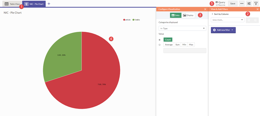
| Number | UI Element | Description |
|---|---|---|
| 1 | Visualization tabs | Navigates between the table and any visualizations in the interpretation |
| 2 | Filters panel | Sorts and filters source data for the interpretation |
| 3 | Configuration panel | Configures data and display settings for the currently selected visualization |
| 4 | Work area | Displays the currently selected table or visualization in the interpretation |
| 5 | Action bar | Contains buttons to save, toggle the filter or configuration panels, and export data |