条形图
条形图是一个包含矩形条的图表。每个条的长度都与它所表示的值成比例。使用条形图可通过单个值比较两个或三个变量。
何时使用它?
基本条形图
条形图用于比较类别:X 轴表示类别,Y 轴表示要比较的值。
提示
您还可以使用基本条形图来创建一个柱状图,以显示 X 轴数据的分布情况。柱状图用与相关值成比例的条来显示选定 X 轴域中每个唯一值的频率。
复杂条形图
条形图可以使用分组条或堆叠条来表示更复杂的类别。分组或堆叠条形图使用第三个变量来细分比较类别:
| Icon | Type | Description |
|---|---|---|
| Grouped | Third dimension values are displayed as adjacent bars or columns within the second dimension value. |
| Stacked | A single second dimension bar or column is divided by the third dimension values. |
| 100% Stacked | A single dimension bar or column is divided by the percentage each third dimension value contributes to the total. |
示例
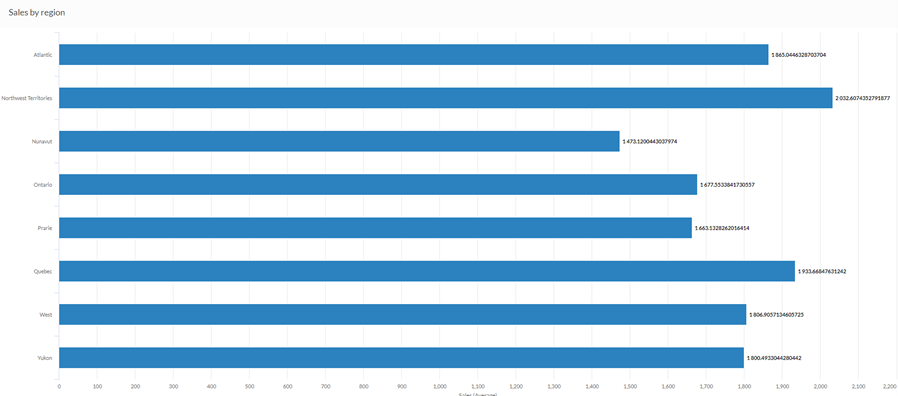
条形图
您的公司正在跟踪销售数据,需要确定销售数额最高的地区。使用条形图,可以直观地显示销售数字,并且清楚地说明各个区域的业绩:
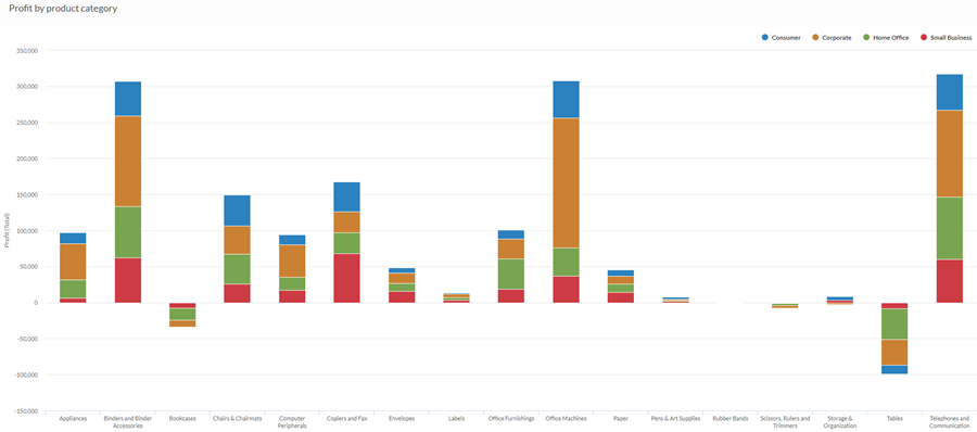
堆叠柱形图
您的公司正在跟踪销售数据,需要确定亏损的产品类别。
使用堆叠条形图,您可以直观地显示销售数字,并且清楚地说明表现不错的产品类别以及表现不佳的产品类别。堆叠第三维还可以帮助您确定每个类别的哪个部分对整个总额贡献最大:
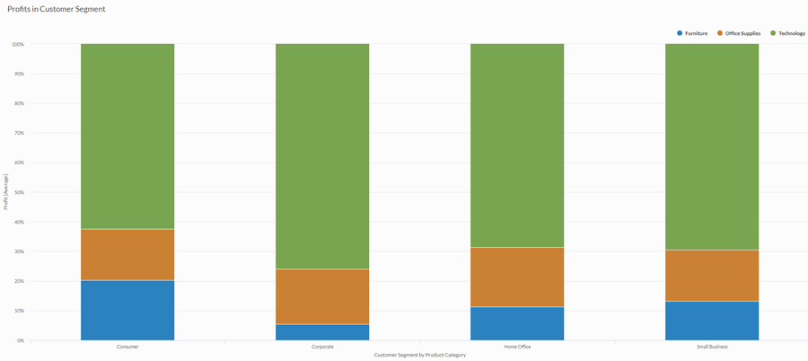
100% 堆叠柱形图
您要对每个客户群的利润进行分析。您想要直观地显示每个产品类别在每个客户群的平均利润中所占的比例。
为此,您使用 100% 堆叠柱形图来显示每个产品类别在客户群值中所占的百分比:
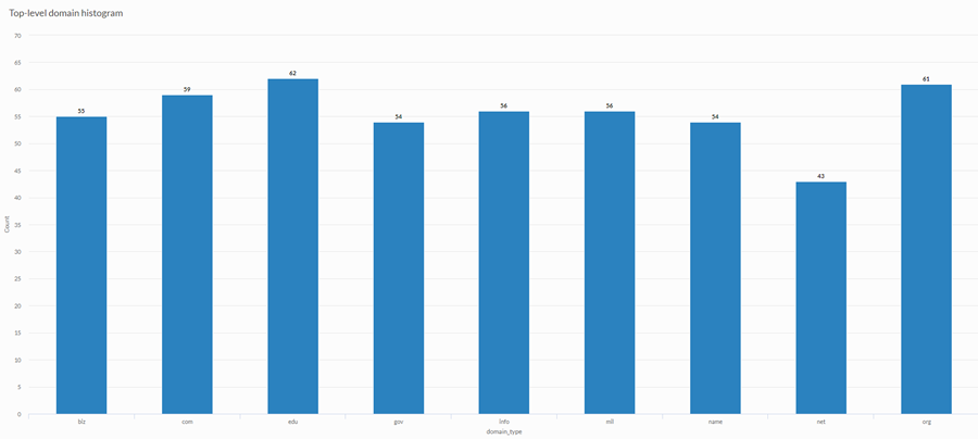
柱状图
您正在对客户网站进行分析,并希望显示站点集合中所使用的顶级域的频率。为此,您使用柱状图,显示表中每个唯一顶级域值的计数:
数据配置设置
从平台主页 (www.diligentoneplatform.com) 中,选择结果应用程序以将其打开。
如果您已经进入 Diligent One,可以使用左侧导航菜单切换到结果应用程序。
- Navigate to the appropriate table.
- On theConfigure
 panel, clickDataand configure the following settings:
| 设置 | 支持的数据类型 | 描述 |
|---|---|---|
X 轴 |
| The field to use as the basis for the chart's horizontal scale. One bar is created for each unique value in the field, or each unique combination of values if you also specify a Color by field. |
Y 轴 | 数值 | The aggregate value represented by the chart's vertical axis. You can select a count of the x-axis field or one of several aggregate values for a different numeric column in the table:
提示 使用计数选项可创建一个柱状图,以显示 X 轴的数据分布情况。 提示 您可以通过更改此域的格式来控制数值类型数据的小数位数和取整方式。 对于平均聚合选项,“格式”选项位于配置可视化效果面板的“数据”选项卡中。对于所有其他聚合选项,则应用在表视图中设置的格式选项。有关执行此操作的帮助,请参阅数据格式化选项。 |
着色依据 可选 | 字符 | 该字段由图表的第三数据维表示。添加第三个数据维度可以细分 X 轴类别。您可以将着色依据域视为一个拆分域。 |
格式选项 | 数值 | 在此域中选择一个选项以将小数位数和取整方式等格式应用于图表中的 Y 轴值。有关执行此操作的帮助,请参阅数据格式化选项。 只有对于平均聚合选项,格式选项才是可用的。对于所有其他聚合选项,则应用在表视图中设置的格式选项。 |
图表显示设置
从平台主页 (www.diligentoneplatform.com) 中,选择结果应用程序以将其打开。
如果您已经进入 Diligent One,可以使用左侧导航菜单切换到结果应用程序。
- Navigate to the appropriate table.
- On theConfigurepanel, clickDisplayand configure the following settings:
| 设置 | 描述 |
|---|---|
| 选项 | |
| Show Legend | Show or hide the legend at the top of the chart. |
| Show Values | Show or hide the data point values. |
| Rotate Horizontal | Display the bar chart with the x-axis on the left-hand side of the chart and the y-axis running horizontally along the bottom of the chart. |
| Show Percentages | 显示或隐藏各部分在整体中所占的比例。
|
| Boost performance | 当图表上的数据点超过 150 个时,通过应用一些折衷来切换到性能模式。要了解更多信息,请参考图表性能提升。 |
| Chart Type | 如何显示图表的第三个维度(着色依据):
|
| X-Axis | |
| Show Label | Show or hide the label for the x-axis. |
| Y-Axis | |
| Show Label | Show or hide the label for the left y-axis. |
| Min | The minimum value to use for the left y-axis. By default, the chart uses the lowest value of the left y-axis data to determine the minimum. |
| Max | The maximum value to use for the left y-axis. By default, the chart uses the highest value of the left y-axis data to determine the minimum. |
| Other settings | |
| Colors | The colors assigned to each series in theColor bydimension. |
Chart sorting settings
从平台主页 (www.diligentoneplatform.com) 中,选择结果应用程序以将其打开。
如果您已经进入 Diligent One,可以使用左侧导航菜单切换到结果应用程序。
- Navigate to the appropriate table.
- On theConfigurepanel, clickSortand configure the following settings:
Setting Description Options Sorting Sorts the data categories by ascending or descending total value, by default (alphabetically), or in custom order. To apply a custom order, click and drag the values in the Sort tab into the necessary order.