组合图
组合图是在一个图中显示两种类型的图表的图形。可以用组合图在一个图上表示与一个共同点相关的两组不同的数据。这包括一个叠加在柱形图上的线状图。组合图可以有两个 Y 轴,用以表示两个不同的测量尺度。您可以在图表显示设置中启用双 Y 轴。
何时使用它?
在比较不同类别的值时,同一可视化中的条线组合非常有用,因为这种组合提供了一个清晰的比较视图。例如,使用组合图比较不同时间段的预计销售额和实际销售额。
如果两个变量具有不同的度量尺度,但与一个共同点相关,当要验证它们之间的关系时,组合图非常有用。例如,当两个图表共享一个共同的类别 X 轴(例如区域),并且可能有多个数量 Y 轴,每个都代表不同的值尺度(例如收入和利润)。
提示
对于跟踪趋势和确定可能需要进一步调查的数据偏差,组合图非常有用。
示例
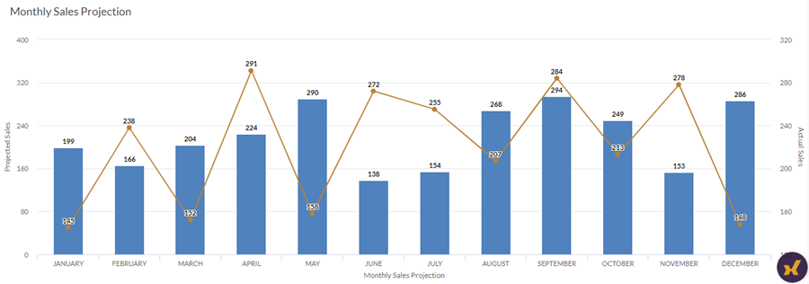
简单组合图
您的公司正在跟踪销售数据,需要确定每月预计销售额与实际销售额的趋势。使用一个简单的双轴组合图,您可以直观地看到销售数字,并清楚地展示给定时期的趋势。
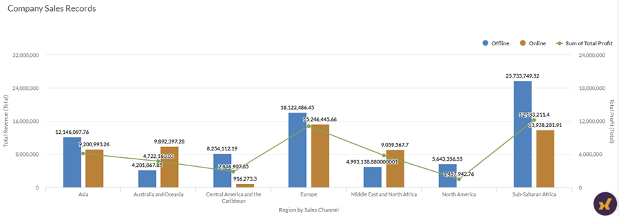
分组组合图
您的公司正在跟踪销售数据,需要确定每个区域产生的总收入与获得的利润总额,区域则按销售渠道分组,即线下和线上。
使用分组的双轴组合图,您可以直观地显示总收入和利润额,并清楚地展示不同区域的趋势比较。分组还可以帮助您确定每个销售渠道产生的收入。
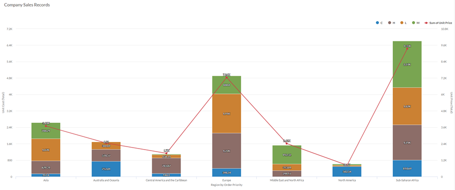
堆叠组合图
您的公司正在跟踪销售数据,需要按区域确定仓库中商品的单位成本与单价,各区域按商品的订单优先级排列,即 关键、高、低和中。
使用堆叠的双轴组合图,您可以直观地显示商品的单位成本和单价,并清楚地展示不同区域的趋势比较。堆叠还可以帮助您根据订单优先级确定单位成本。
数据配置设置
从平台主页 (www.diligentoneplatform.com) 中,选择结果应用程序以将其打开。
如果您已经进入 Diligent One,可以使用左侧导航菜单切换到结果应用程序。
- 导航到适当的表。
- 在配置
 面板上,单击数据并配置下列设置:
| 设置 | 支持的数据类型 | 描述 |
|---|---|---|
X 轴 |
| The field to use as the basis for the chart's horizontal scale. One bar is created for each unique value in the field, or each unique combination of values if you also specify a Color by field. |
Y 轴 列 | 数值 | The aggregate value represented by the chart's vertical axis. You can select a count of the x-axis field or one of several aggregate values for a different numeric column in the table:
提示 使用计数选项可创建一个柱状图,以显示 X 轴的数据分布情况。 提示 您可以通过更改此域的格式来控制数值类型数据的小数位数和取整方式。 对于平均聚合选项,“格式”选项位于配置可视化效果面板的“数据”选项卡中。对于所有其他聚合选项,则应用在表视图中设置的格式选项。有关执行此操作的帮助,请参阅数据格式化选项。 |
Y 轴 直线 | 数值 | The aggregate value represented by the chart's vertical axis. You can select a count of the x-axis field or one of several aggregate values for a different numeric column in the table:
The position of data points on the vertical scale determines the height of each line. The height of a line is interpolated or gapped if a data point is missing. 提示 您可以通过更改此域的格式来控制数值类型数据的小数位数和取整方式。 对于平均聚合选项,“格式”选项位于配置可视化效果面板的“数据”选项卡中。对于所有其他聚合选项,则应用在表视图中设置的格式选项。有关执行此操作的帮助,请参阅数据格式化选项。 |
着色依据 可选 | 字符 | 该字段由图表的第三数据维表示。添加第三个数据维度可以细分 X 轴类别。您可以将着色依据域视为一个拆分域。 |
格式选项 | 数值 | 在此域中选择一个选项以将小数位数和取整方式等格式应用于图表中的 Y 轴值。有关执行此操作的帮助,请参阅数据格式化选项。 只有对于平均聚合选项,格式选项才是可用的。对于所有其他聚合选项,则应用在表视图中设置的格式选项。 |
图表显示设置
从平台主页 (www.diligentoneplatform.com) 中,选择结果应用程序以将其打开。
如果您已经进入 Diligent One,可以使用左侧导航菜单切换到结果应用程序。
- 导航到适当的表。
- 在配置 面板上,单击显示并配置下列设置:
| 设置 | 描述 |
|---|---|
| 选项 | |
| Show Legend | Show or hide the legend at the top of the chart. |
| Show Values | Show or hide the data point values. |
| Round Edges | Smooths out the transitions between data points to create a curved line chart. |
| Boost performance | 当图表上的数据点超过 150 个时,通过应用一些折衷来切换到性能模式。要了解更多信息,请参考图表性能提升。 |
| Column Type | 如何显示图表的第三个维度(着色依据):
|
| X-Axis | |
| Show Label | Show or hide the label for the x-axis. |
| Y-Axis (Left) | |
| Show Label | Show or hide the label for the left y-axis. |
| Min | The minimum value to use for the left y-axis. By default, the chart uses the lowest value of the left y-axis data to determine the minimum. |
| Max | The maximum value to use for the left y-axis. By default, the chart uses the highest value of the left y-axis data to determine the minimum. |
| Show dual Y-Axis | Show or hide the Y-Axis (Right). |
| Y-Axis (Right) | |
| Show Label | Show or hide the label for the right y-axis. |
| Min | The minimum value to use for the right y-axis. By default, the chart uses the lowest value of the right y-axis data to determine the minimum. |
| Max | The maximum value to use for the right y-axis. By default, the chart uses the highest value of the right y-axis data to determine the minimum. |
| Other settings | |
| Colors | The colors assigned to each series in theColor bydimension. |
图表排序设置
从平台主页 (www.diligentoneplatform.com) 中,选择结果应用程序以将其打开。
如果您已经进入 Diligent One,可以使用左侧导航菜单切换到结果应用程序。
- 导航到适当的表。
- 在配置 面板上,单击排序并配置下列设置:
设置 描述 选项 Sorting Sorts the data categories by ascending or descending total value, by default (alphabetically), or in custom order. To apply a custom order, click and drag the values in the Sort tab into the necessary order.
说明
根据列值应用排序