热图
热图是数据的图形表示形式,其中,模型中包含的单个值被表示为颜色。数据点由 x 轴和 y 轴的交点以及确定该数据点颜色的第三个值定义。
何时使用它?
使用热图可比较大量类别中的变量以及按颜色强度对复杂数据进行排序。
工作原理介绍
数据值
数据值显示为热图上的框。每个框的大小和颜色由该项的数据决定:
- 大小由 X 和 Y 轴类别的密集程度决定并且不可配置
- 颜色由在着色依据设置中指定的计算值决定
渐变色与阶梯颜色
默认情况下,最低值被渲染成绿色,中等大小的值被渲染成黄色,最高值被渲染成红色。颜色完全可自定义。
数据点被使用下列显示设置着色方案之一渲染成彩色:
- 颜色渐变按照单个数据值,从绿色到黄色,再到红色,持续变化。
- 阶梯颜色刻度将数据值分组到等距类别中,并且使用离散颜色显示它们
您可以自定义将图表显示设置中数据值分组的阶梯数。
示例
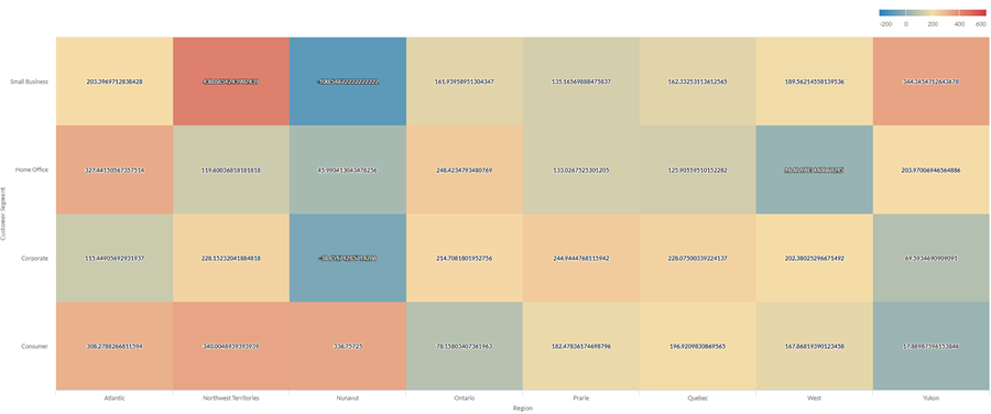
热图
您希望使用公司的销售数据,在两个维度上显示大量类别的平均利润:地区和客户群。为此,您需创建一个热图。平均利润值按颜色分类,从蓝色(低)到红色(高)不等:
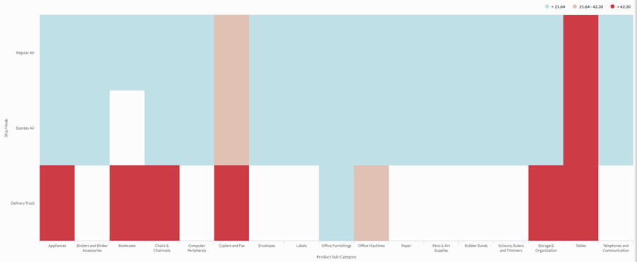
阶梯热图
您需要检查您的公司的运输方式和产品类别之间的关系。您正在寻找一个简单的分析,可将平均运输成本分成三个箱:低、中、高。
为了可视化这种关系,您可以创建一个有三个阶梯的阶梯热图。基于阶梯阈值将值分组到相应的箱中:
数据配置设置
From the Platform home page (www.diligentoneplatform.com), select the Results app to open it.
If you are already in Diligent One, you can use the left-hand navigation menu to switch to the Results app.
- Navigate to the appropriate table.
- On theConfigure
 panel, clickDataand configure the following settings:
| 设置 | 支持的数据类型 | 描述 |
|---|---|---|
| X-Axis |
| The field to use as the category on the chart's horizontal scale. |
| Y-Axis |
| The field to use as the category on the chart's vertical scale. |
| Color by | numeric | The field that determines the color of the box at the intersection of the X and Y axis values:
Tip You can control decimals and rounding on numeric data by changing format of this field. For the Average aggregate option, Format options is available in the Data tab of the Configure Visualization panel. For all other aggregate options, format options set in Table View is applied. For help doing this, see 数据格式化选项. |
Format options | numeric | Select an option in this field to apply formatting such as decimals and rounding to the Y-axis values in the chart. For help doing this, see 数据格式化选项. Format options is available only for the Average aggregate option. For all other aggregate options, format options set in Table View is applied. |
图表显示设置
From the Platform home page (www.diligentoneplatform.com), select the Results app to open it.
If you are already in Diligent One, you can use the left-hand navigation menu to switch to the Results app.
- Navigate to the appropriate table.
- On theConfigurepanel, clickDisplayand configure the following settings:
| 设置 | 描述 |
|---|---|
| 选项 | |
| Show Legend | Show or hide the legend at the top of the chart. |
| Show Values | Show or hide the data point values. |
| Boost performance | Switches into performance mode when data points on the chart go beyond 150 by applying some trade-offs. For more information, see 图表性能提升. |
| X-Axis | |
| Show Label | Show or hide the label for the x-axis. |
| Y-Axis | |
| Show Label | Show or hide the label for the left y-axis. |
| Other settings | |
| Color | The starting, middle, and ending values for the heatmap range. You can specify a color and numeric boundary for each place on the scale. |
| Stepped Colors | Display the categories as discrete buckets rather than a constant scale. You can specify between 2 and 20 steps. |