折线图
线状图通过显示一系列由直线线段连接的数据点,显示趋势或随着时间的推移而发生的变化。可以通过“着色依据”字段将单个数据字段显示为基于不同类别的多行。
何时使用它?
使用线状图可跟踪短期或长期变化,以帮助进行预测性数据分析。如果该系列中存在较小而频繁的变化,则线状图在可视化随着时间的推移而发生的变化方面比条形图更有效。
线状图还用于比较多个组或类别在同一时段发生的变化。
提示
请在您的线状图的 X 轴上使用独立变量(如时间或日期),在 Y 轴上使用依赖性数值变量。
示例
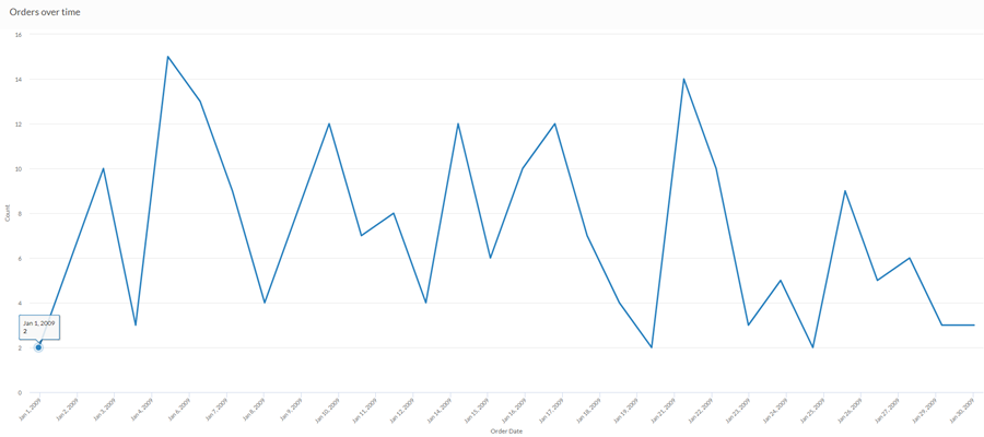
简单线状图
您希望使用上个月的销售数据,显示随时间推移的订单趋势。为此,您使用绘制订单数量的线状图:
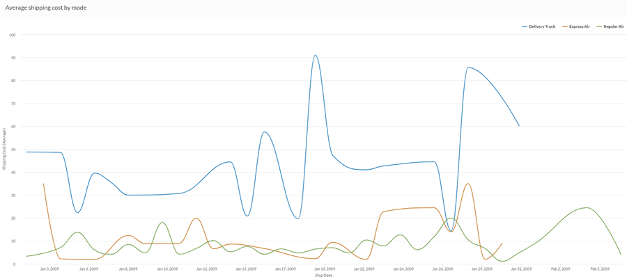
多系列曲线图
您希望使用上个月的销售数据,显示您的公司所采用的每种运输方式的平均运费趋势。为此,您使用线状图,按照运输方式对每个系列进行分组:
数据配置设置
从平台主页 (www.diligentoneplatform.com) 中,选择结果应用程序以将其打开。
如果您已经进入 Diligent One,可以使用左侧导航菜单切换到结果应用程序。
- Navigate to the appropriate table.
- On theConfigure
 panel, clickDataand configure the following settings:
| 设置 | 支持的数据类型 | 描述 |
|---|---|---|
| X-Axis |
| The field to use as the basis for the chart's horizontal scale. Using a character field as the basis for the x-axis allows you to display a line chart that shows X number of comparisons for a given Y value aggregate. This is especially useful when combined with the Color by option, which allows you to display separate lines, differentiated by color, for each selected field. Character fields along the x-axis are sorted in alphabetical order by default. |
Y 轴 | numeric | The aggregate value represented by the chart's vertical axis. You can select a count of the x-axis field or one of several aggregate values for a different numeric column in the table:
The position of data points on the vertical scale determines the height of each line. The height of a line is interpolated or gapped if a data point is missing. 提示 您可以通过更改此域的格式来控制数值类型数据的小数位数和取整方式。 对于平均聚合选项,“格式”选项位于配置可视化效果面板的“数据”选项卡中。对于所有其他聚合选项,则应用在表视图中设置的格式选项。有关执行此操作的帮助,请参阅数据格式化选项。 |
着色依据(可选设置) | character | 该字段由图表的第三数据维表示。添加第三个数据维度可创建由线条表示的类别。对于该字段中的每个唯一值,都会创建一个单独的线条。 |
格式选项 | 数值 | 在此域中选择一个选项以将小数位数和取整方式等格式应用于图表中的 Y 轴值。有关执行此操作的帮助,请参阅数据格式化选项。 只有对于平均聚合选项,格式选项才是可用的。对于所有其他聚合选项,则应用在表视图中设置的格式选项。 |
图表显示设置
从平台主页 (www.diligentoneplatform.com) 中,选择结果应用程序以将其打开。
如果您已经进入 Diligent One,可以使用左侧导航菜单切换到结果应用程序。
- Navigate to the appropriate table.
- On theConfigurepanel, clickDisplayand configure the following settings:
| 设置 | 描述 |
|---|---|
| 选项 | |
| Show Legend | Show or hide the legend at the top of the chart. |
| Show Values | Show or hide the data point values. |
| Round Edges | Smooths out the transitions between data points to create a curved line chart. |
| Interpolate | 使用可用的数据点连接线条,但不绘制 X 轴上缺失的数据点,从而处理缺少的数据点。 如果被禁用,则不会跨缺少的数据点连接该线条。 |
| Boost performance | 当图表上的数据点超过 150 个时,通过应用一些折衷来切换到性能模式。要了解更多信息,请参考图表性能提升。 |
| X-Axis | |
| Show Label | Show or hide the label for the x-axis. |
| Y-Axis | |
| Show Label | Show or hide the label for the left y-axis. |
| Min | The minimum value to use for the left y-axis. By default, the chart uses the lowest value of the left y-axis data to determine the minimum. |
| Max | The maximum value to use for the left y-axis. By default, the chart uses the highest value of the left y-axis data to determine the minimum. |
| Other settings | |
| Colors | The colors assigned to each series in theColor bydimension. |