面积图
面积图通过显示每个类别在任一时刻在合计数中所占的比例,比较历史趋势或变化。当比较多个数据系列时,堆叠面积图揭示了总体趋势而不是单个值。
何时使用它?
使用面积图可显示每个类别在随着时间的推移的累计总数中所占的比例。
很少图表能够在表示时间序列关系方面像面积图那样有效。该图表的面积部分表示轴和数据点之间的空间大小或在整体中所占的比例。
提示
时间序列是一系列按时间顺序列出的数据点,这些数据点之间通常具有相等的间隔。
可用的面积图类型
可使用以下类型的面积图:
| Icon | Type | Description |
|---|---|---|
| Standard | Shows a quantitative progression over time. | |
| Stacked | Shows the proportion of the total that each category represents at any given point in time. | |
| 100% Stacked | Shows how the constituent parts of a whole have changed over time. |
示例
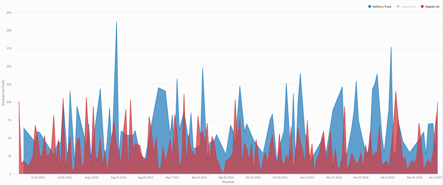
标准面积图
使用四年期的汇总销售数据时,您需要为您的公司使用的运输方式传达运输成本趋势。为此,您创建一个标准面积图,显示该期间的按运输方式分类的成本趋势:
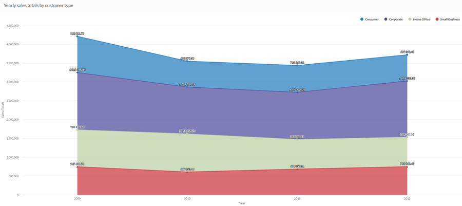
堆叠面积图
使用四年期间的汇总销售数据,揭示随时间推移不同的客户群体在整体销售中的比例趋势。为此,您可以创建一个堆叠面积图,显示该期间的趋势:
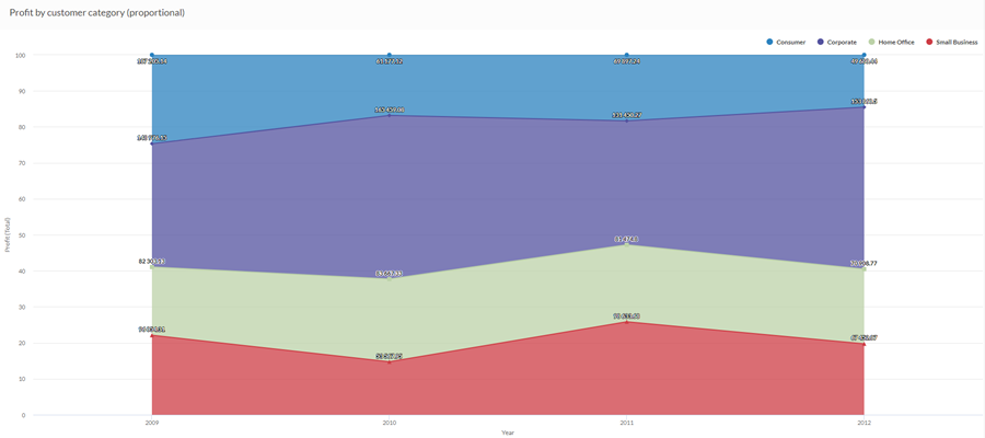
100% 堆叠面积图
使用四年期内的汇总销售数据,需要了解不同客户群体的销售情况如何随时间而变化。为此,您可以创建一个 100% 堆叠面积图,显示每个客户群随时间推移相对于销售总额的影响:
数据配置设置
从平台主页 (www.diligentoneplatform.com) 中,选择结果应用程序以将其打开。
如果您已经进入 Diligent One,可以使用左侧导航菜单切换到结果应用程序。
- Navigate to the appropriate table.
- On theConfigure
 panel, clickDataand configure the following settings:
| 设置 | 支持的数据类型 | 描述 |
|---|---|---|
| X-Axis |
| The field to use as the basis for the chart's horizontal scale. |
Y 轴 | numeric | The aggregate value represented by the chart's vertical axis. You can select a count of the x-axis field or one of several aggregate values for a different numeric column in the table:
The position of data points on the vertical scale determines the height of each line. The height of a line is interpolated or gapped if a data point is missing. 提示 您可以通过更改此域的格式来控制数值类型数据的小数位数和取整方式。 对于平均聚合选项,“格式”选项位于配置可视化效果面板的“数据”选项卡中。对于所有其他聚合选项,则应用在表视图中设置的格式选项。有关执行此操作的帮助,请参阅数据格式化选项。 |
着色依据 可选 | character | 该字段由图表的第三数据维表示。添加第三个数据维度可创建由堆叠区域表示的类别。对于该字段中的每个唯一值,都会创建一个单独的堆叠区域。 |
格式选项 | 数值 | 在此域中选择一个选项以将小数位数和取整方式等格式应用于图表中的 Y 轴值。有关执行此操作的帮助,请参阅数据格式化选项。 只有对于平均聚合选项,格式选项才是可用的。对于所有其他聚合选项,则应用在表视图中设置的格式选项。 |
图表显示设置
从平台主页 (www.diligentoneplatform.com) 中,选择结果应用程序以将其打开。
如果您已经进入 Diligent One,可以使用左侧导航菜单切换到结果应用程序。
- Navigate to the appropriate table.
- On theConfigurepanel, clickDisplayand configure the following settings:
| 设置 | 描述 |
|---|---|
| 选项 | |
| Show Legend | Show or hide the legend at the top of the chart. |
| Show Values | Show or hide the data point values. |
| Interpolate | 使用可用的数据点连接线条,但不绘制 X 轴上缺失的数据点,从而处理缺少的数据点。 如果被禁用,则不会跨缺少的数据点连接该线条。 |
| Boost performance | 当图表上的数据点超过 150 个时,通过应用一些折衷来切换到性能模式。要了解更多信息,请参考图表性能提升。 |
| Chart Type | 使用的面积图类型:
|
| X-Axis | |
| Show Label | Show or hide the label for the x-axis. |
| Y-Axis | |
| Show Label | Show or hide the label for the left y-axis. |
| Min | The minimum value to use for the left y-axis. By default, the chart uses the lowest value of the left y-axis data to determine the minimum. |
| Max | The maximum value to use for the left y-axis. By default, the chart uses the highest value of the left y-axis data to determine the minimum. |
| Other settings | |
| Colors | The colors assigned to each series in theColor bydimension. |