树状图表
树状图将分层的树结构数据显示为一组嵌套矩形。每个组都被给予一个矩形,这些矩形随后被更小的表示子组的矩形所覆盖。尺寸和颜色被用来显示数据的不同数值维度。
何时使用它?
在处理大量具有分层结构的数据时,请使用树状图。当颜色和尺寸被相互关联时,树状图可以帮助识别难以发现的模式。
在清晰地在单个屏幕中显示大量信息方面,树状图也很有效。这样,查看者可以深入到特定类别中以考察进一步的信息。
说明
此时,树状图支持多达两个级别的分组。
示例
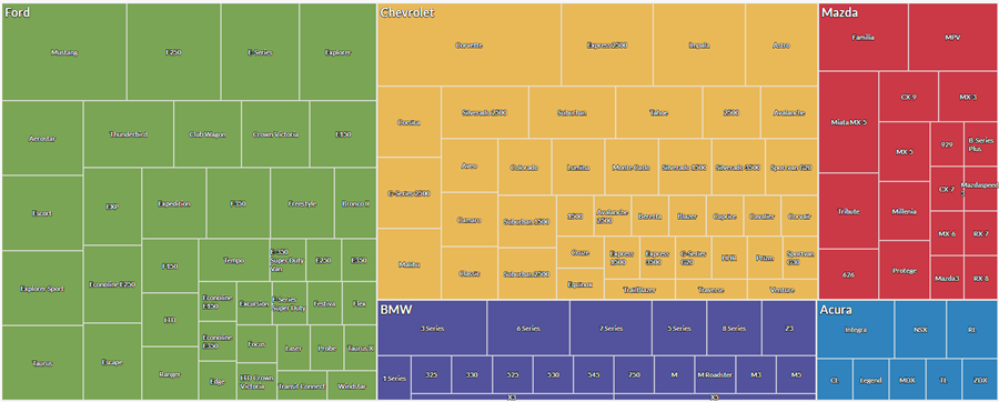
汽车制造商和型号
您有一个表,其中包含汽车库存。您想要直观地显示每家制造商的汽车型号数量,以获取库存概览。
为了直观地显示此数据,您使用树状图以:
- 首先按制造商,然后按型号对数据进行分组
- 将尺寸调整依据设置为车辆数
基于结果,您可以查看库存在制造商和型号之间的分布情况:
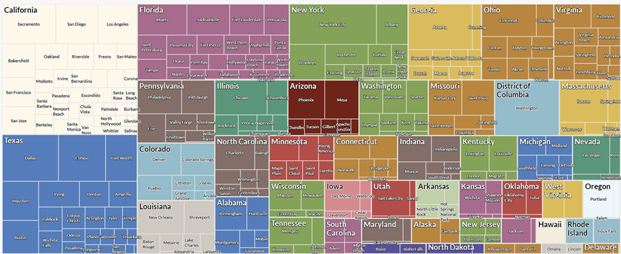
按州和城市统计的交易合计额
您有一个表,其中包含美国多个州和城市的交易。作为您的分析的一部分,您想要按照州和每个州内的城市直观地显示合计交易金额。
为了直观地显示此数据,您使用树状图以:
- 您首先按州,然后按城市对数据进行分组。
- 将尺寸调整依据设置为交易之和
基于结果,您可以查看下列组内的聚合交易金额开始呈现的模式:
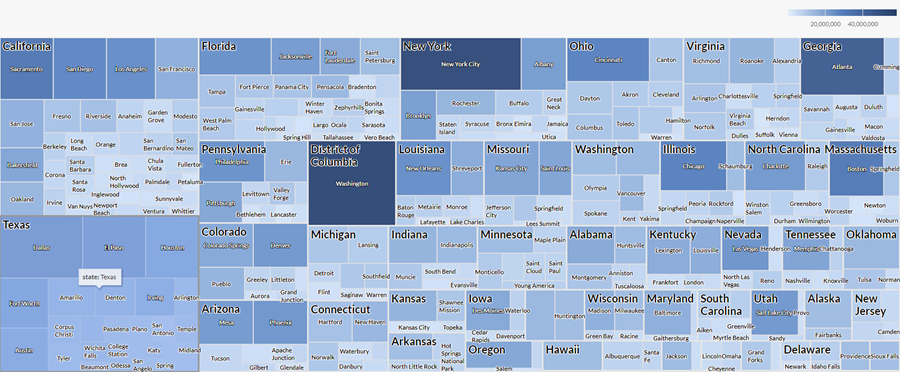
按州和城市统计的交易数和合计金额
您有一个表,其中包含美国多个州和城市的交易。作为您的分析的一部分,您想要按照州和每个州内的城市直观地显示交易数和合计交易金额。
为了直观地显示此数据,您使用树状图。您首先按州,然后按城市对数据进行分组。您还使用下列附加设置:
- 尺寸调整依据计数
- 着色依据交易总和
基于结果,您可以确定交易在不同城市和州组合之间的分布情况,并且查看下列组内的聚合交易金额开始呈现的模式:
数据配置设置
From the Platform home page (www.diligentoneplatform.com), select the Results app to open it.
If you are already in Diligent One, you can use the left-hand navigation menu to switch to the Results app.
- Navigate to the appropriate table.
- On theConfigure
 panel, clickDataand configure the following settings:
| 设置 | 支持的数据类型 | 描述 |
|---|---|---|
| Group |
| The fields to use as categories. The second group you select is nested within the first group. Groups are displayed as rectangles. You can select a maximum of two groups. |
| Size by | numeric | The aggregate value that determines the size of each group. You can select a count of records or one of several aggregate values for a numeric column in the table:
Tip You can control decimals and rounding on numeric data by changing format of this field. For the Average aggregate option, Format options is available in the Data tab of the Configure Visualization panel. For all other aggregate options, format options set in Table View is applied. For help doing this, see 数据格式化选项. |
Color by optional | numeric | The aggregate value that determines the color intensity, or scale, of each group. You can select a count of records or one of several aggregate values for a numeric column in the table:
Tip You can control decimals and rounding on numeric data by changing format of this field. For the Average aggregate option, Format options is available in the Data tab of the Configure Visualization panel. For all other aggregate options, format options set in Table View is applied. For help doing this, see 数据格式化选项. |
Format options | numeric | Select an option in this field to apply formatting such as decimals and rounding to the Y-axis values in the chart. For help doing this, see 数据格式化选项. Format options is available only for the Average aggregate option. For all other aggregate options, format options set in Table View is applied. |
图表显示设置
From the Platform home page (www.diligentoneplatform.com), select the Results app to open it.
If you are already in Diligent One, you can use the left-hand navigation menu to switch to the Results app.
- Navigate to the appropriate table.
- On theConfigurepanel, clickDisplayand configure the following settings:
| 设置 | 描述 |
|---|---|
| 选项 | |
| Show Legend | Show or hide the legend at the top of the chart. |
| Boost performance | Switches into performance mode when data points on the chart go beyond 150 by applying some trade-offs. For more information, see 图表性能提升. |
| Group Labels | |
| Show First Group | Include labels for values in the first group. |
| Show Second Group | Include labels for values in the second group. |
| Other settings | |
| Colors | The colors assigned to:
|